You know how some emails look super clean in your inbox? While others show weird text like “View this email online” or random HTML code? There’s a simple trick that makes the difference.
Preview text is that little snippet you see next to your subject line. It’s like a mini preview of your email. This space is gold for getting people to open your emails.
But here’s the problem. If you don’t control it, email apps just grab whatever text they find first. That means people might see your unsubscribe link or other random stuff instead of your actual message.

The Preview Text Hack Explained
Remember invisible ink from when you were a kid? You could write something that nobody could see, but it was still there. That’s exactly what this does.
We force inboxes to show only what you want by adding a block of invisible characters after your preview text. It pads the space. Makes sure no other text sneaks into that inbox preview line.
It’s stupidly simple:
- Add a hidden <div> or <span> to your email.
- Inside, stuff whitespace characters like  , ͏, and ­.
- Inboxes see the blank space, stop pulling extra content into the preview.
Your subscribers? They never see it.
Their inbox? Looks clean, professional.
Your open rates? Protected from ugly fallback lines.
We use those HTML codes:
-   (figure space)
- ͏ (combining double inverted breve)
- ­ (soft hyphen)
- ‌ (zero-width non-joiner)
- (non-breaking space)
Important: This hack works in most email apps. It won’t work everywhere, but it will improve things for most of your subscribers.
Here’s the complete code. It’s that long just to be sure it work well even with the longest previews.
<!– Invisible Ink Preview Text Hack –>
<div style=”display: none; max-height: 0px; overflow: hidden;”>
<!– First: Reliable visible spacing –>
 ͏  ͏  ͏  ͏  ͏  ͏  ͏  ͏  ͏  ͏  ͏  ͏  ͏  ͏  ͏  ͏  ͏  ͏  ͏  ͏  ͏  ͏  ͏  ͏  ͏  ͏  ͏  ͏  ͏  ͏  ͏  ͏  ͏  ͏  ͏  ͏  ͏  ͏  ͏  ͏  ͏  ͏  ͏  ͏  ͏  ͏  ͏  ͏  ͏  ͏  ͏  ͏  ͏  ͏  ͏  ͏  ͏  ͏  ͏  ͏  ͏  ͏  ͏  ͏  ͏  ͏  ͏  ͏  ͏  ͏  ͏  ͏  ͏  ͏  ͏  ͏  ͏  ͏  ͏  ͏  ͏  ͏  ͏  ͏  ͏  ͏  ͏  ͏  ͏  ͏  ͏  ͏  ͏  ͏  ͏  ͏  ͏  ͏  ͏  ͏  ͏  ͏  ͏  ͏  ͏  ͏  ͏  ͏  ͏  ͏  ͏  ͏  ͏  ͏  ͏  ͏  ͏  ͏  ͏  ͏  ͏  ͏  ͏  ͏  ͏  ͏  ͏  ͏  ͏  ͏  ͏  ͏  ͏  ͏  ͏  ͏  ͏  ͏  ͏  ͏  ͏  ͏  ͏  ͏  ͏  ͏  ͏  ͏  ͏  ͏  ͏  ͏  ͏  ͏  ͏  ͏  ͏  ͏  ͏  ͏  ͏  ͏  ͏  ͏  ͏  ͏  ͏  ͏  ͏  ͏  ͏  ͏  ͏  ͏  ͏
<!– Then: Soft invisible padding to push extra content out –>
­ ­ ­ ­ ­ ­ ­ ­ ­ ­ ­ ­ ­ ­ ­ ­ ­ ­ ­ ­ ­ ­ ­ ­ ­ ­ ­ ­ ­ ­ ­ ­ ­ ­ ­ ­ ­ ­ ­ ­ ­ ­ ­ ­ ­ ­ ­ ­ ­ ­ ­ ­ ­ ­ ­ ­ ­ ­ ­ ­ ­ ­ ­ ­ ­ ­ ­ ­ ­ ­ ­ ­ ­ ­ ­ ­ ­ ­ ­ ­ ­ ­ ­ ­ ­ ­ ­ ­ ­ ­ ­ ­ ­ ­ ­ ­ ­ ­ ­ ­ ­ ­ ­ ­ ­ ­ ­ ­ ­ ­ ­ ­ ­ ­ ­ ­ ­ ­ ­ ­ ­ ­ ­ ­ ­ ­ ­ ­ ­ ­ ­ ­ ­ ­ ­ ­ ­ ­ ­ ­ ­ ­ ­ ­ ­ ­ ­ ­ ­ ­ ­ ­ ­ ­ ­ ­ ­ ­ ­ ­ ­ ­ ­ ­ ­ ­ ­ ­ ­ ­ ­ ­ ­ ­ ­ ­ ­ ­ ­ ­ ­ ­ ­ ­ ­ ­ ­ ­ ­ ­ ­ ­ ­ ­ ­ ­ ­ ­ ­ ­ ­ ­ ­ ­ ­ ­ ­ ­ ­ ­ ­ ­ ­ ­ ­ ­ ­ ­ ­ ­ ­ ­ ­ ­ ­ ­ ­ ­ ­ ­ ­ ­ ­ ­ ­ ­ ­ ­ ­ ­ ­ ­ ­ ­ ­ ­ ­ ­ ­ ­ ­ ­ ­ ­ ­ ­ ­ ­ ­ ­ ­ ­ ­ ­ ­ ­ ­ ­ ­ ­ ­ ­ ­ ­ ­ ­ ­ ­ ­ ­ ­ ­ ­ ­ ­ ­ ­ ­ ­ ­ ­ ­ ­ ­ ­ ­ ­ ­ ­ ­ ­
</div>
How it works:
  and ͏
These are unicode whitespace characters (like En Quad and similar) that create guaranteed, fixed blank space. They’re highly reliable for forcing visible spacing in the inbox preview but remain hidden inside the email body because they sit inside a hidden <div>.
­
This is a soft hyphen, technically an invisible character that browsers or email clients only render when they need to break a word across lines. But when placed inside a hidden block, it acts as lightweight, invisible padding.
The reason they stack ­ characters at the end is because:
- Some email clients aggressively trim trailing blank spaces but keep soft hyphens.
- ­ adds “length” invisibly, but doesn’t risk breaking layout or injecting unwanted space visually.
- It pads out the remaining space without triggering layout quirks in more sensitive clients like Outlook.
Can you mix them?
Sure, but this tested order keeps things predictable. It works across Gmail, Apple Mail, Outlook – even the weird ones.
Want extra padding?
Just copy-paste more of those lines. But honestly, that set is usually plenty unless your email starts with “View this online” or other junk you want to bury deep.
How to Use This Hack in MailerLite
Step 1: Create Your Campaign
Make a new email campaign in MailerLite. Pick your template.
Step 2: Add Your Preview Text
In the campaign settings, write your preview text in the “Preheader” field (very top of your email).
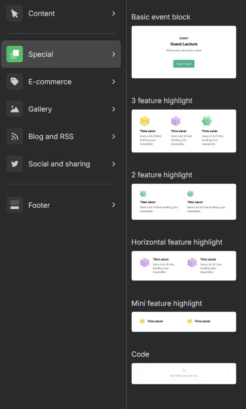
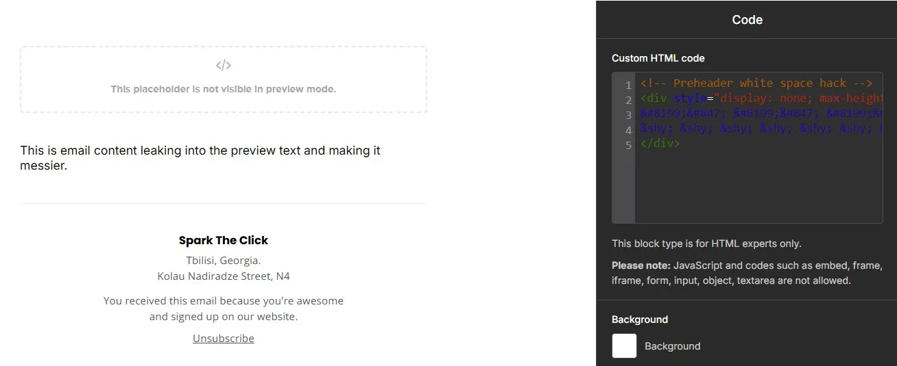
Step 3: Add a Code Block
In your email template, drag a “Code” block from the content blocks menu. Put it at the very top of your email. Make sure it’s above everything else.
Step 4: Add the Hack Code
In the Code block editor, paste the complete hack code from the section above.
Step 5: Save and Test
Save your changes. Send yourself a test email to see how it looks.
How to Do It in Kit (ConvertKit)
Step 1: Create Your Email
Make a new email in ConvertKit. You can do this as a broadcast or as part of a sequence.
Step 2: Set Your Preview Text
In the email settings, find the “Preview text” field. Write your preview text there.
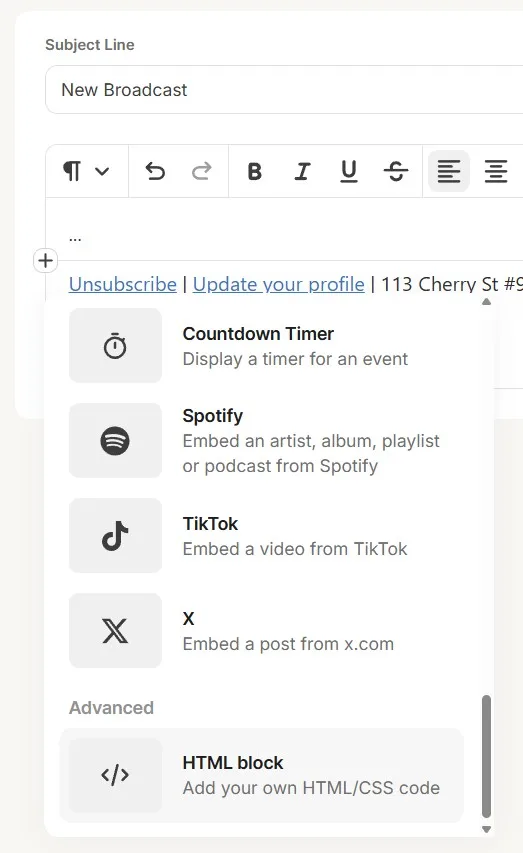
Step 3: Add a HTML Block
In the email editor, add a “HTLM block” from the content blocks menu (little black + icon in the editor). Put it at the very top of your email template. Make sure it’s above all other content.
 Step 4: Add the Hack Code
 Step 4: Add the Hack Code
In the Code block, paste the complete hack code from the section above.
Step 5: Preview and Test
Send test emails to check that the preview text hack works.
Quick Notes
- These entities are invisible to the reader, but inboxes “see” the space.
- Works in most major inboxes: Gmail, Apple Mail, Outlook.
- No, it doesn’t break deliverability — big brands use this trick daily.
- You don’t need 500 characters of padding — just enough to push unwanted text out.
- Don’t rely on it completely – it’s a nice improvement, not a magic button.